How I did create Basalte Fonts Family
I think it all started around 2014. I joined a friend of mine in a new atelier and started getting interesting in Street Art. And while reading one of the many magazines we had there, I stubbled upon a post about L’Atlas. I loved the geometry used in his works, but most of all how he could deal between shapes and letters, making his art between abstract and a concrete message.

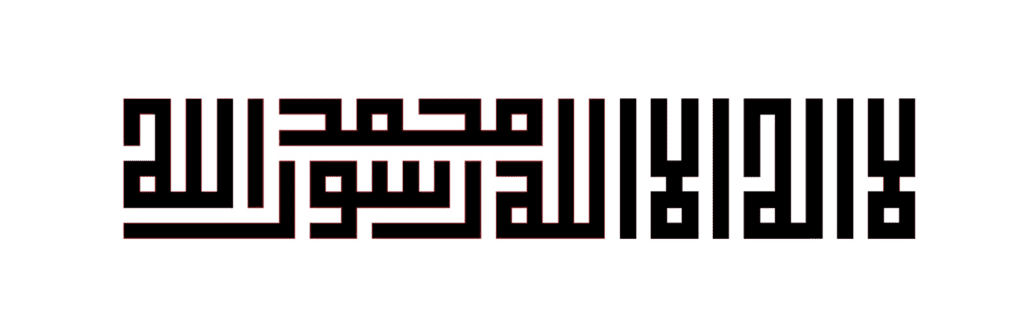
In that same article, the artist talked about his bigginfluence, Kufic arabic calligraphy. I then searched the web for more information and examples. What I found out was totally interesting. I also got interested in how this calligraphic style did evolve from classic calligraphy to something really geometrical and kind of systemic. And above all how it became real pieces of art.

I, then, started to do some sketches on my side, trying to explore these forms of letters and how they interact together. Through the work of L’Atlas I understood the use of interlocks that I liked a lot in 50/60s lettering from the US and develop into a great font, Ed Interlock, from House Industries.
Around 2016, I started drawing many of sketches around that american style but also the kufic one, using interlocks and trying to stay readable. Here are a few examples I did post on Instagram at that time. Tutsplus even created a tutorial to learn how to imitate kufic style.
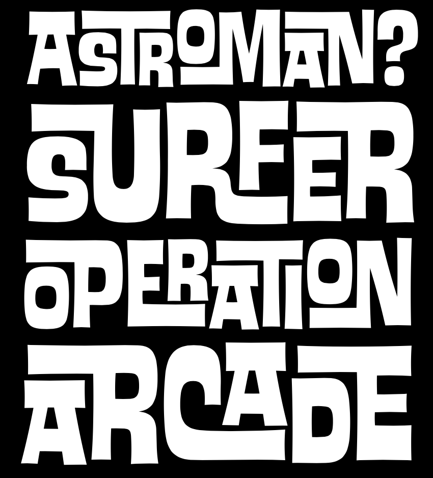
And during my second challenge “100 days of lettering”, I did a work that started to make me think about a font. This is that one (sorry, quality of the picture is not good, damned Instagram…):
I did draw a kind of system here, with very condensed characters and a transversal/horizontal line above the middle, which I had to deal with, in order to do each letterform. That was a great exercise. And I said to myself I should design the whole alphabet. It will take me some time before I do it.
While that period of time, a font came out that was based on the kufic system. This is Calcula, from Typotheque. This was probably the first font that used Opentype features to create these interlocking letters, applied to kufic or geometric glyphs. If I was not a big fan of the letterforms themselves or the other styles than the Solid one, I really loved how you could type and see all these letters work together like in Tetris. Surely it has influenced how I made the ligatures in Basalte.

After making the letters in Procreate on my iPad, I did copy them to Illustrator and vectorized them. I then opened Glyphs to create the font. Once the first alphabet was done, 26 letters and 10 numbers, I started playing with them and quickly realized that these counterforms were too dominant and that I had to rework the letterforms and spaces to occupy it that its maximum. That is where I decided to start create ligatures to introduce interlocks.
I created around 350 ligatures after letters T, P and L where the counterforms of the letters were too big. I did use the same method I recommend in my book.
To do ligatures in the font, I had to study Opentype features. This was one of the biggest challenge of that work. But coming from the web industry and having done some Javascript or PHP, Opentype features were not so hard… at least for ligatures.
So what I had to do was to replace two letters by a ligature and tell the software to replace T and L by TL ligature. I did this for around 350 combinaisons.
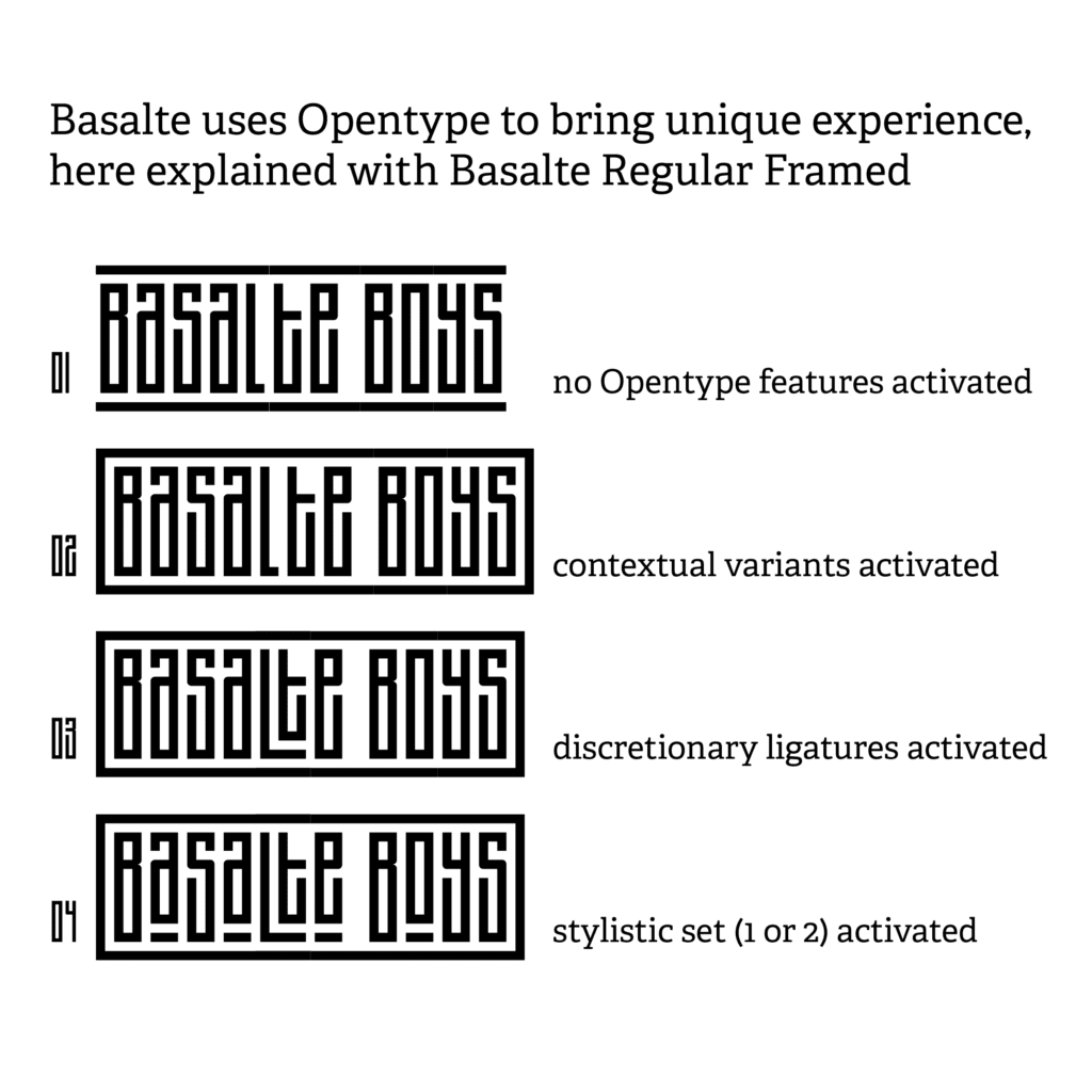
Basalte Regular was ready first around the end of 2019. But something was missing. To me that was not totally the spirit of kufic and how L’Atlas was working with it. It had to have a frame around it. But how to create that frame…
I checked online Opentype features references and discover .init and .fina. These two features allow you to have a special letter at the beginning (.init) or at the end (.fina) of a word. That was exactly what I needed to open and close the frame before the first letter and after the last letter. Between these 2, I would reuse the letters of Basalte Regular but with a piece of the frame above and below them.

Here are the 3 versions of the a: a.init, a and a.fina.
So after having created more than 350 glyphes “only” for Basalte Regular, here I needed to create the same letters and ligatures three times in order to have all of them at the beginning, the middle or the end of a word! It means around 1000 glyphes!
Doing these glyphes was a real pain in the *** to be honest but that was not my biggest problem. Creating ligatures with Opentype features was not that hard, even if dealing with that frame and its conditions was really difficult. “If this is the first letter, then use that glyph. If this is the last one, use that glyphs, otherwise, use that glyph.”…
But yes, the biggest problem was not creating these Opentype functions. My biggest issue was making them work on softwares!! Especially Adobe ones!! OMG, I thought I came back some years before when I had to deal with 3/4 different versions of Internet Explorer when testing a website. Adobe was the Microsoft of Type Design?
It surely was as I had to change code several times or create one or two hacks to make the font work on all softwares. Illustrator and InDesign did work pretty well where Photoshop was dealing differently with Opentype than its siblings…
Basalte Regular and Regular Framed were ready around march 2020. The launch was finally planned. And while making one or two visuals with Basalte for a distributor, I accidently used the outline button in Illustrator. And the selected letter became bolder. I clicked again the outline button, several times and Basalte became bolder to become a beautiful fat letter. I was in love with it. I then, decided to try again with a whole word and wow I was totally crazy about it.
This is how Basalte Fat and Fat Framed were created… I took me 5 months to do these 2 new styles, trying to figure out how deal with small letters in ligatures becoming fat. Sometimes I had to decide to not include them. But early september, Basalte Family was finally done. I sent it to my friends Jérémie and Guillaume to beta test each style. I had to solve few problems and version 1.0 was ready!!
Here are the different styles and options:


To finish that kind of case study, let’s talk about the name. Why Basalte? First, Basalte in french is Basalt in english, but I am sure you got it. Basalte is a mineral that can appear in huge vertical bars when in solid state. One of the best example might be Devil’s Postpile in Yosemite National Park. Bars are really narrow, geometric and that is how I found the relationsship between it and my font. Yes, that may sound a bit weird but that is never easy to find a name for a font ;-)
So, Basalte Fonts Family is now available exclusively on my website. You can buy each style separately or get the whole family as a pack.